Winter is here, and there’s nothing quite like sinking into a living room that feels like a big, warm hug. For me, the true magic of a cozy space isn’t just about plush blankets or a flickering fire; it starts with the right colors. A warm color palette can instantly transform a room from cold and stark to inviting and intimate, making you want to linger longer with a good book or happy conversation.
I remember when my own living room felt a bit… chilly. It had cool tones that looked great in summer, but come December, it just felt unwelcoming. It wasn’t until I experimented with shifting my wall color and textiles that I truly understood the power of warmth. It’s like wrapping your entire room in a soft, sun-drenched blanket! If you’re ready to infuse your space with inviting hues, these 13 palettes are your secret weapon for creating that perfect cozy haven.
Understanding Warm Palettes
Warm colors generally include reds, oranges, yellows, and earthy tones like brown and beige. They advance in a space, making a room feel more intimate and inviting, as if pulling the walls in for a snug embrace.
The Palettes: Your Recipe for a Cozy Living Room
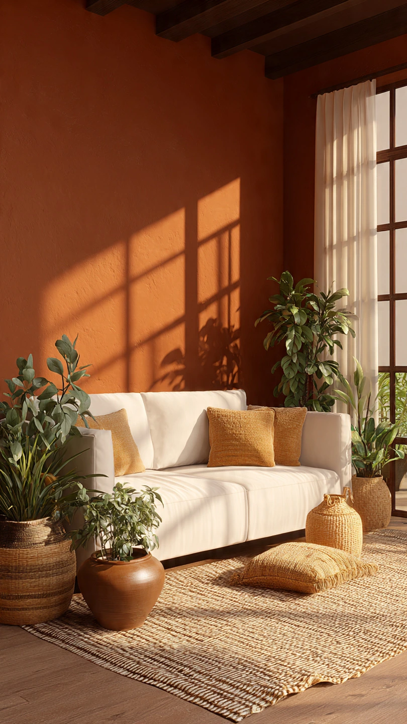
1. Spiced Ginger & Cream
- Colors: Deep burnt orange, soft cream, warm off-white.
- Why it’s cozy: Reminiscent of ginger cookies and frothy lattes. The deep orange provides rich warmth, balanced by crisp, creamy neutrals that prevent it from feeling too heavy.
- Sensory description: Imagine the comforting aroma of ginger mixed with the soft touch of a cashmere throw.
- How I’d use it: A feature wall in burnt orange, cream linen curtains, and a mix of off-white and cream throw pillows.
2. Fireside Glow
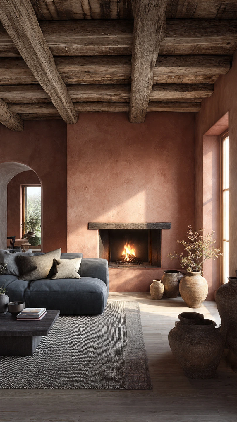
- Colors: Muted terracotta, warm grey, charcoal.
- Why it’s cozy: Earthy and sophisticated, like a rustic fireplace. The terracotta brings heat, while the greys keep it grounded and modern.
- Bonus Insight: Terracotta has a subtle reddish undertone that works beautifully with natural wood furniture.
3. Golden Hour Harmony
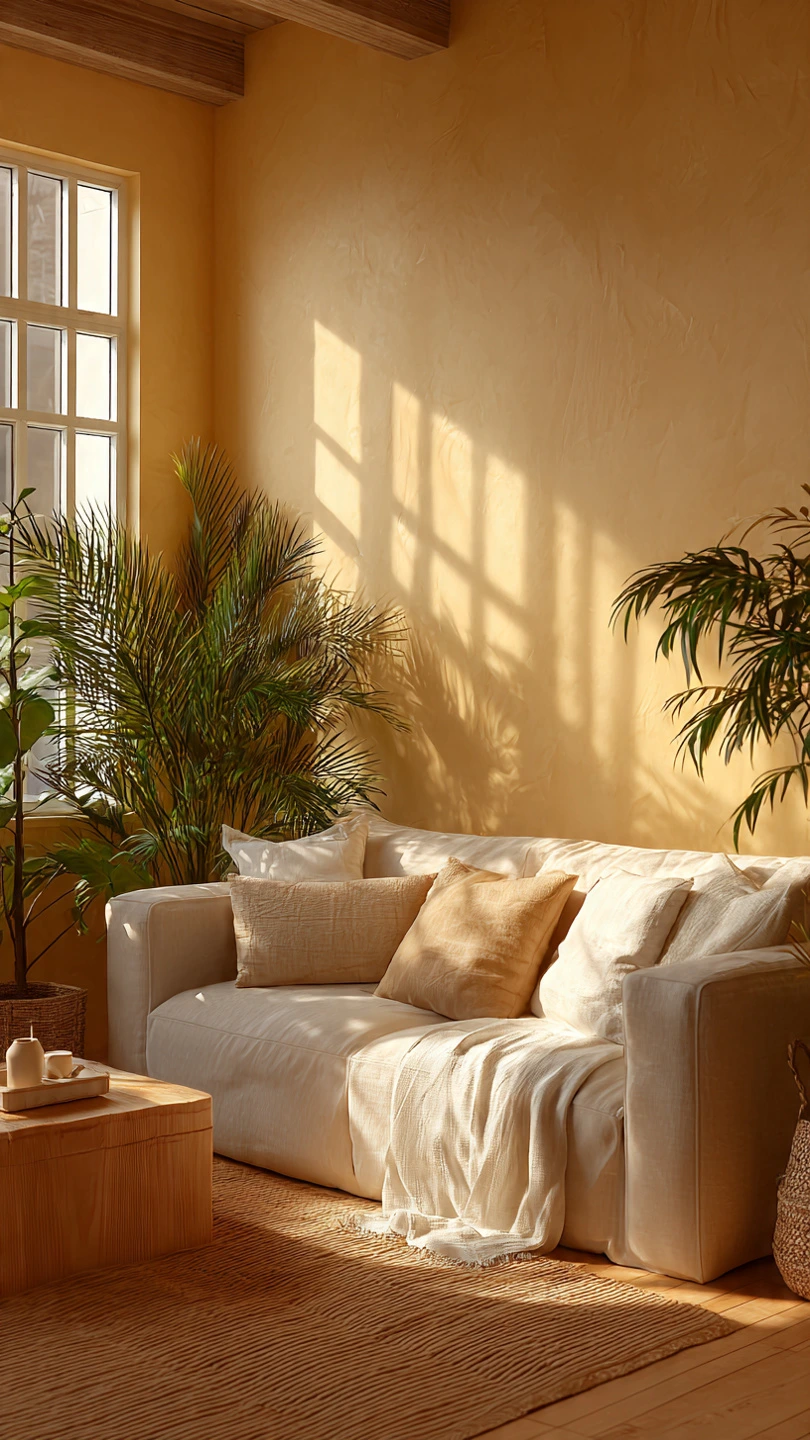
- Colors: Soft golden yellow, natural beige, light sand.
- Why it’s cozy: Evokes the last, soft light of a sunny day. It’s bright yet mellow, bringing cheer without being overwhelming.
- Real-life detail: I tried this by painting my entryway a soft golden yellow. It truly feels like walking into sunshine every day.
4. Autumn Orchard
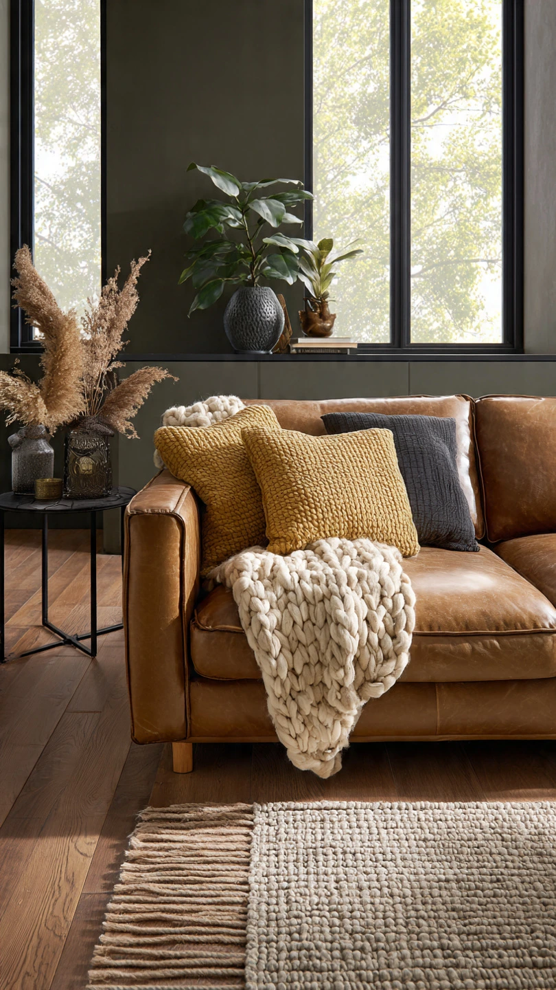
- Colors: Deep olive green, mustard yellow, rich caramel brown.
- Why it’s cozy: Like a stroll through an orchard in late fall. The green provides depth, while mustard and caramel add spicy warmth.
- Tips & Alternatives: Pair with natural wood furniture and dark leather accents for a truly grounded feel.
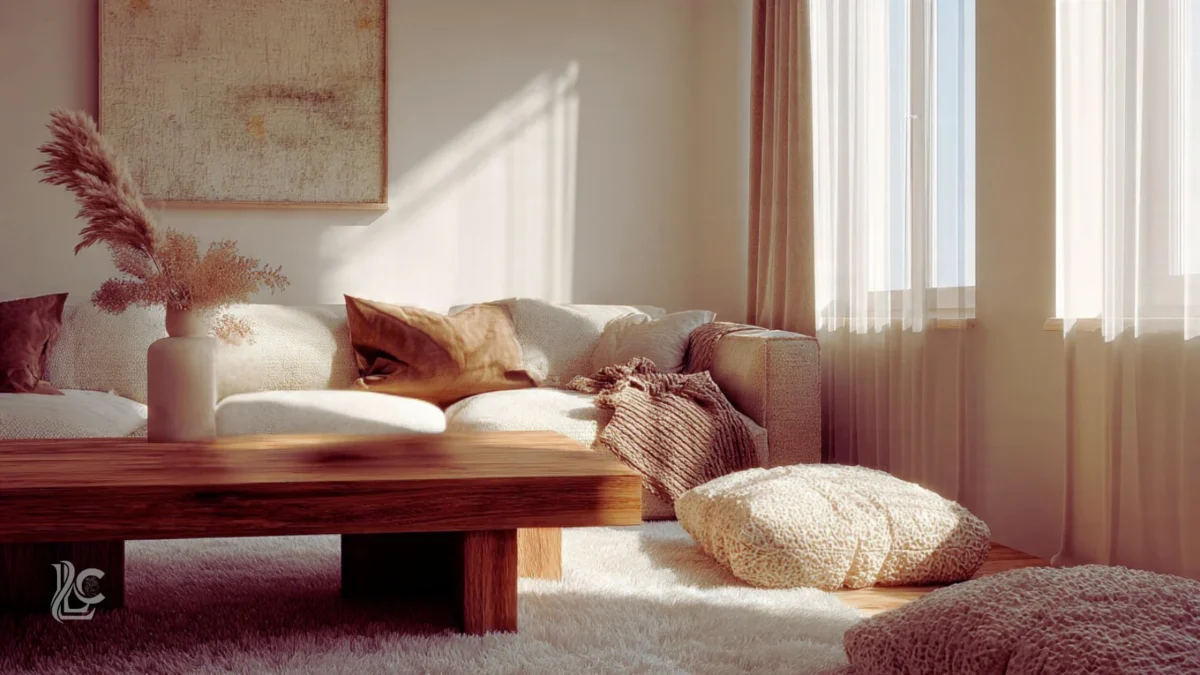
5. Cashmere Comfort
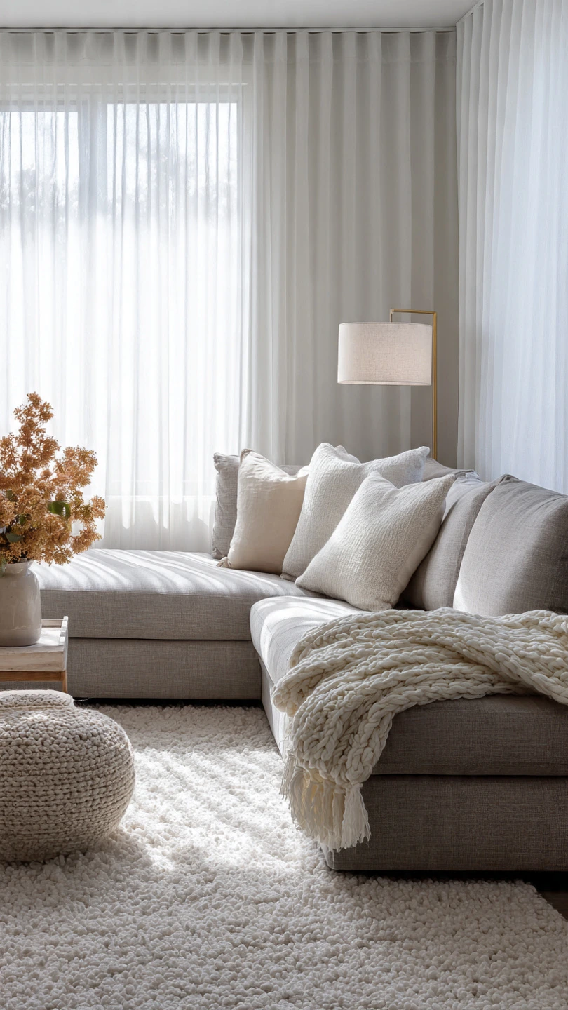
- Colors: Warm taupe, creamy oatmeal, light almond.
- Why it’s cozy: The ultimate neutral warmth. These colors feel soft, inviting, and incredibly sophisticated, like a luxurious cashmere sweater.
- Sensory description: Picture the gentle, fluffy feel of a sheepskin rug underfoot, bathed in soft, diffused light.
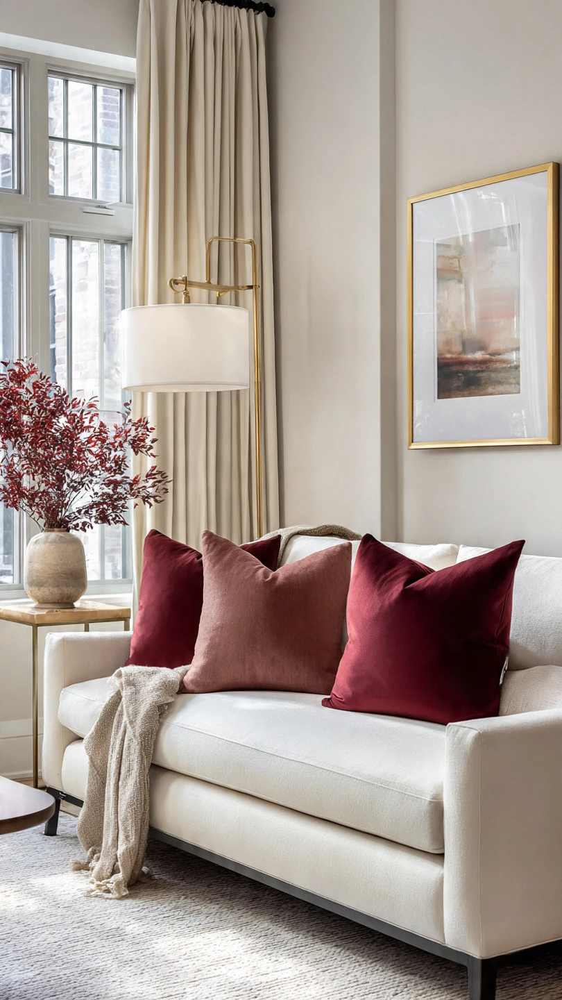
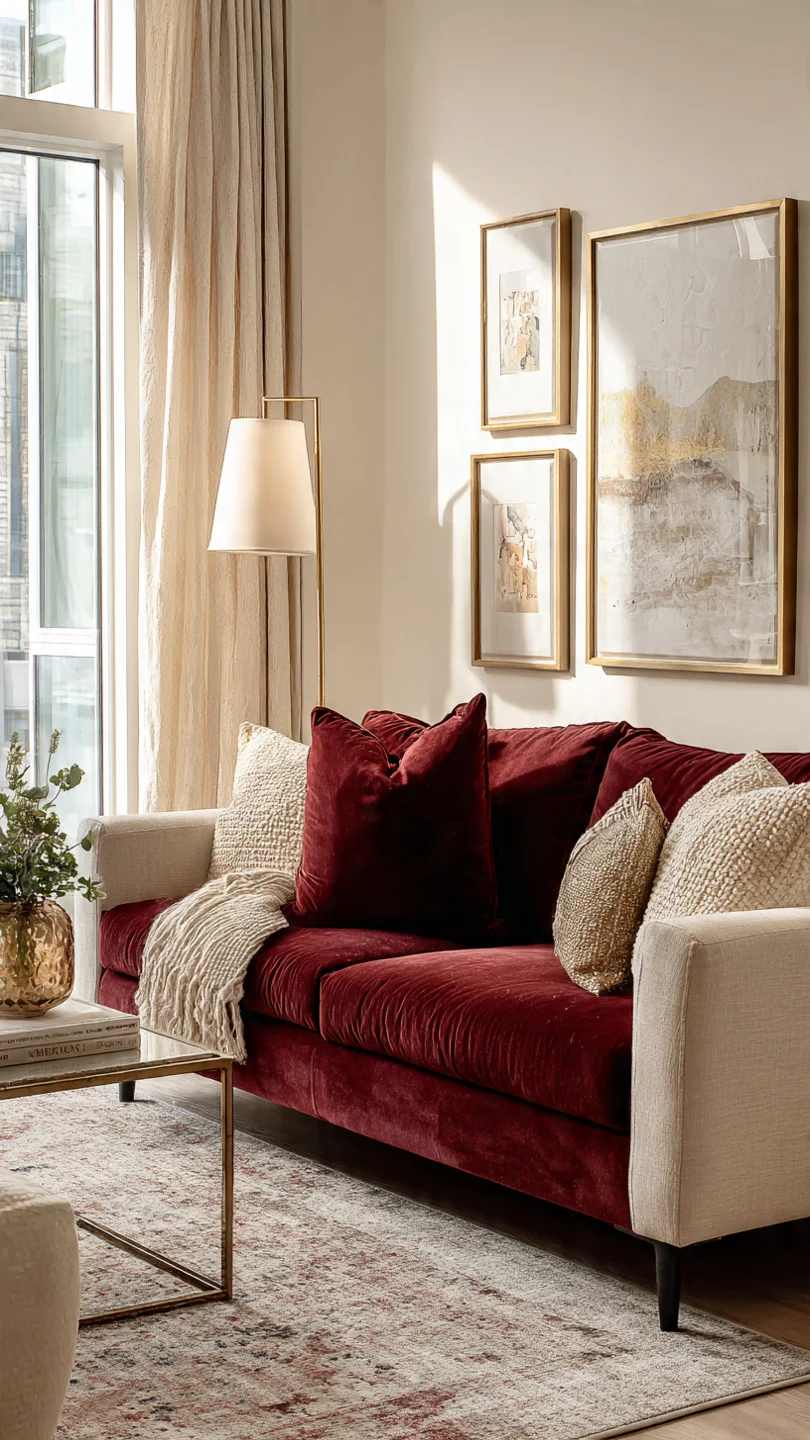
6. Rustic Ruby
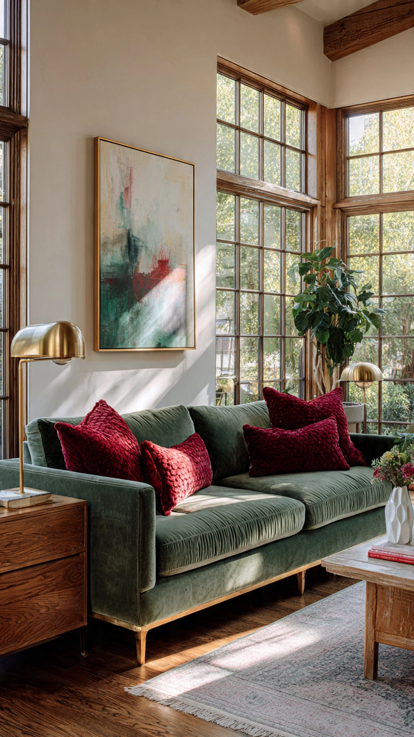
- Colors: Muted ruby red, deep forest green, antique brass.
- Why it’s cozy: A rich, traditional warmth. The red isn’t too bold, leaning more towards a deep berry, while the green provides a strong, natural contrast.
- How I’d use it: Ruby throw pillows on a forest green velvet sofa. The brass accents add a touch of timeless elegance.
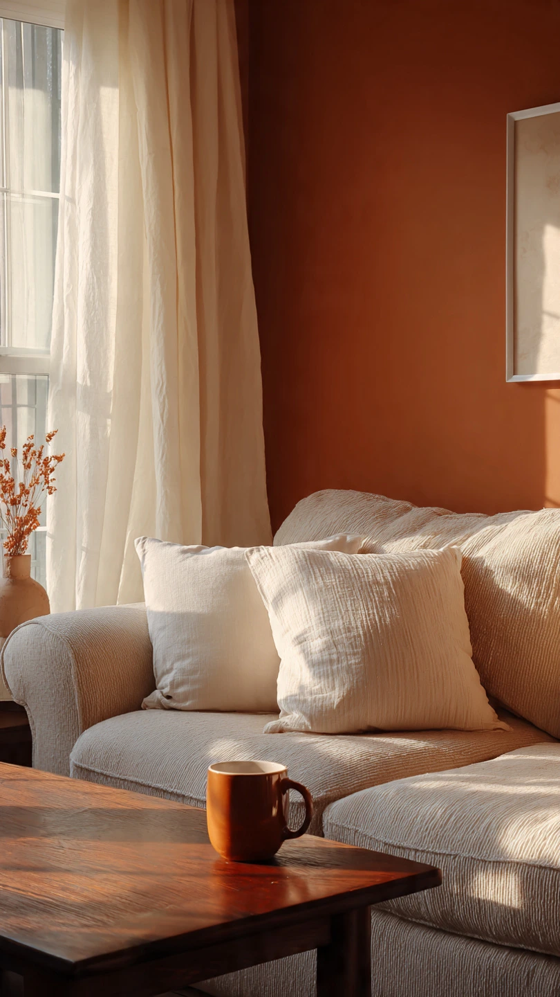
7. Desert Sunset
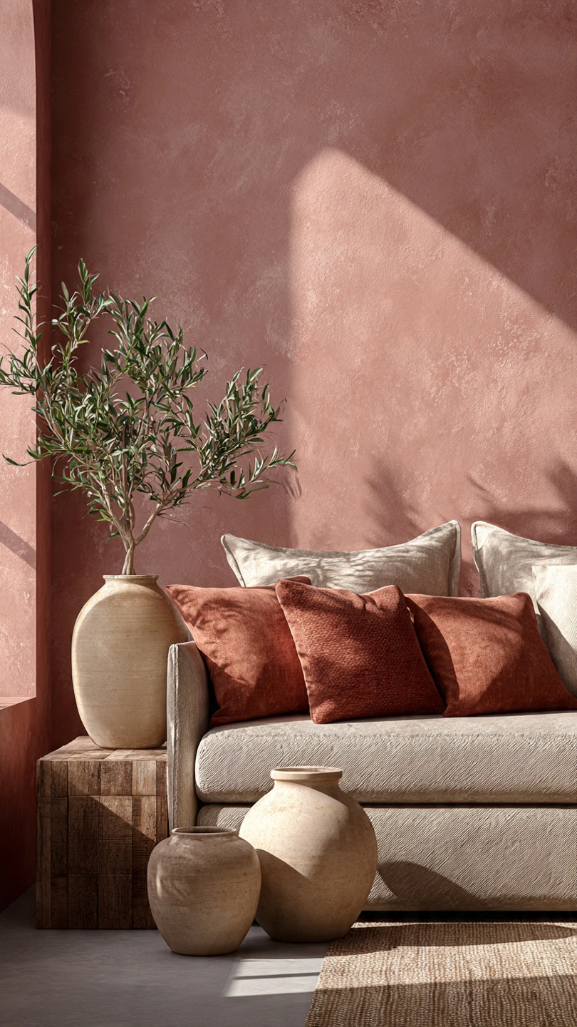
- Colors: Dusty rose, warm rust, light clay.
- Why it’s cozy: Inspired by the gentle, fading light of a desert sunset. It’s warm and inviting, with a touch of soft romance.
- Did You Know?: These soft, earthy pinks and oranges are incredibly versatile and pair well with both light and dark woods.
8. Golden Spice Market
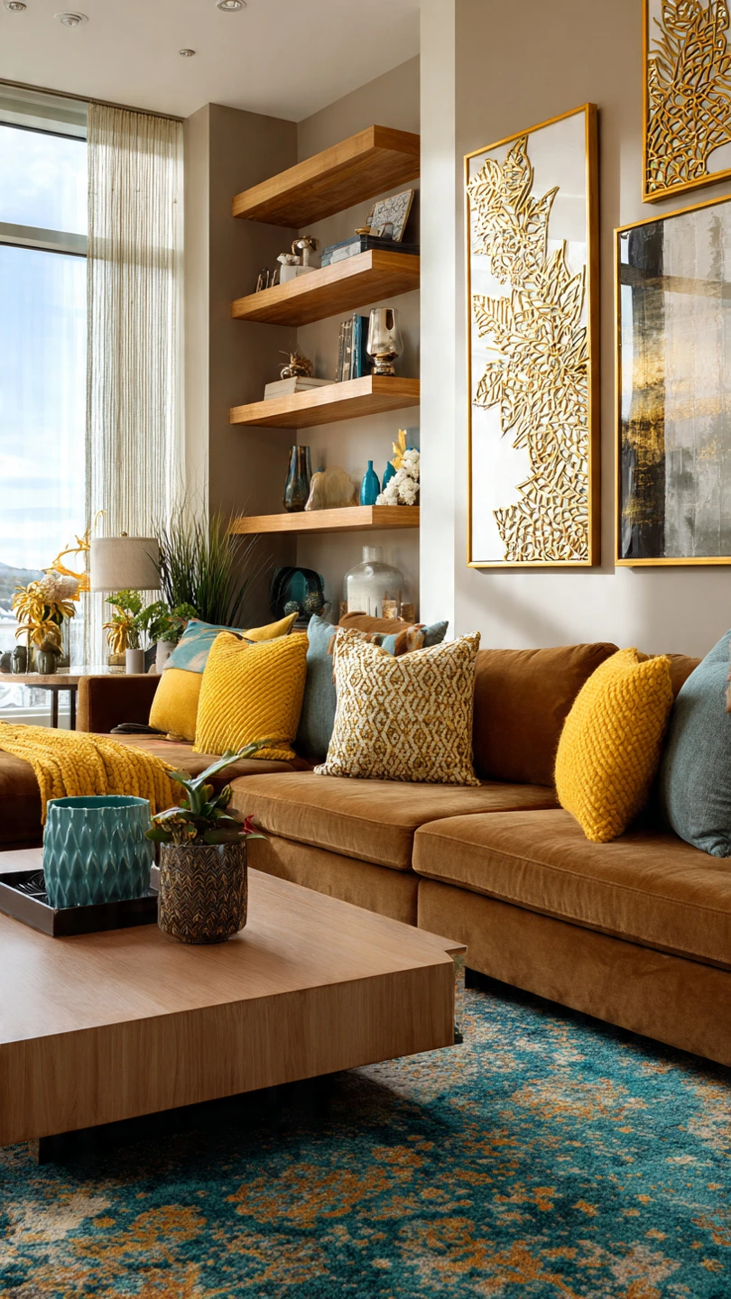
- Colors: Saffron yellow, cinnamon brown, a hint of deep teal.
- Why it’s cozy: A vibrant, exotic warmth. The saffron is invigorating, softened by the spice-market browns, with teal providing a sophisticated contrast.
- Try This Hack: Use the saffron on smaller accents like throw blankets or ceramic vases. The teal could be a subtle pattern in a rug.
9. Terra Cotta & Sage
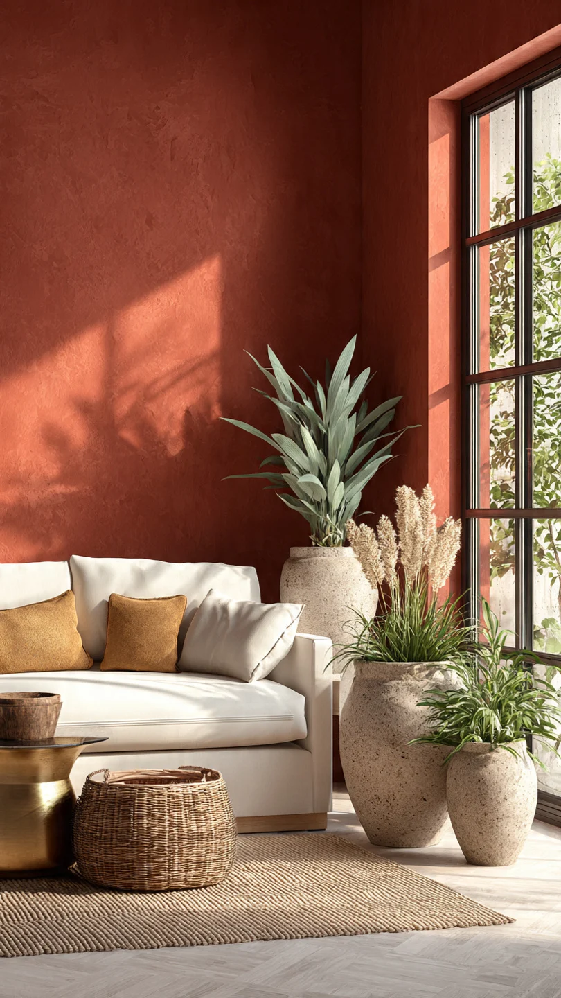
- Colors: Earthen terracotta, soft sage green, warm white.
- Why it’s cozy: A balanced, natural warmth. The earthy red of terracotta is beautifully complemented by the calming, herbaceous sage.
- Personal Win: I used this palette in my sunroom, and it feels so fresh and grounding, like being surrounded by beautiful potted plants.
10. Baked Apple & Vanilla
- Colors: Deep cranberry red, creamy vanilla, warm beige.
- Why it’s cozy: Comforting and reminiscent of homemade treats. The deep red is rich without being overwhelming, perfectly balanced by the sweet, light neutrals.
- Sensory description: Imagine the sweet, comforting smell of baked apples mingled with the soft, yielding texture of a vanilla-hued wool blanket.
11. Sunny Caramel
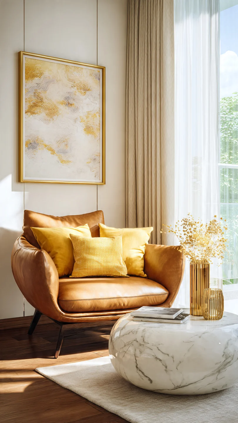
- Colors: Rich caramel, cheerful buttercup yellow, soft off-white.
- Why it’s cozy: A delicious, inviting warmth. Caramel provides depth and richness, while the buttercup yellow adds a cheerful, sunny disposition.
- Real-life detail: A caramel-colored armchair in a room with buttercup yellow throw pillows creates an instant focal point that just feels happy.
12. Smoky Rose Gold
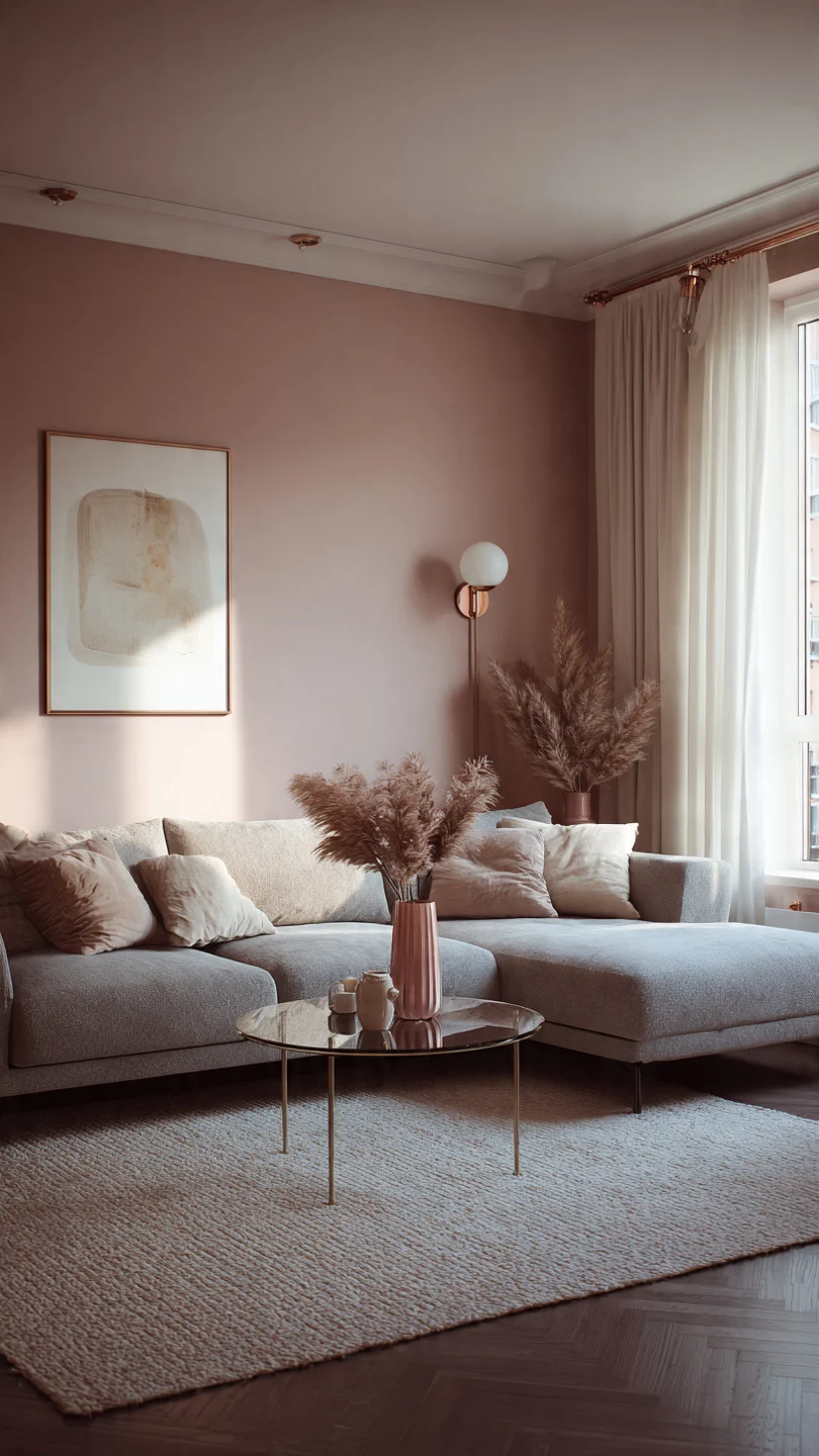
- Colors: Muted rose pink, soft grey, metallic rose gold accents.
- Why it’s cozy: A modern, gentle warmth. The dusty rose is comforting, while the grey grounds it. The rose gold adds a subtle, luxurious shimmer.
- Tips & Alternatives: Use rose gold in metallic details like lamp bases, picture frames, or even a subtle patterned wallpaper.
13. Toasted Chestnut
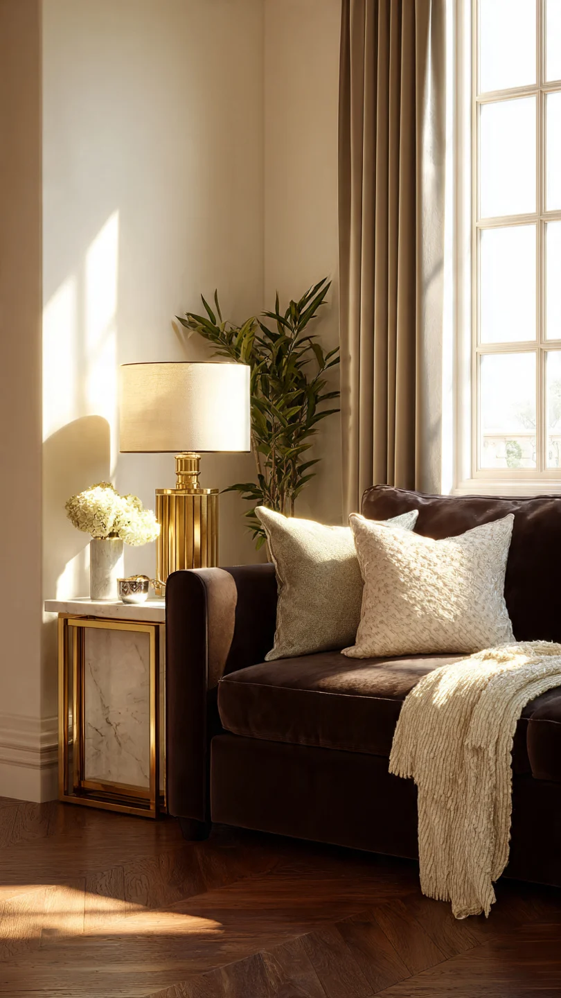
- Colors: Deep chocolate brown, warm beige, a hint of cream.
- Why it’s cozy: Earthy, sophisticated, and incredibly grounding. These deep browns create a sense of secure enclosure, perfect for a den-like living room.
- How I’d use it: A large, comfy sofa in a toasted chestnut brown, with light beige walls and cream textured throws. It feels like stepping into a peaceful, quiet retreat.
Your Cozy Living Room Awaits!
Choosing a warm color palette is all about creating a feeling—that inviting embrace that welcomes you home. Don’t be afraid to experiment with paint swatches or mix and match textiles. Remember, your home is your sanctuary, and these colors are simply tools to help you craft the perfect cozy haven.
Which of these palettes sparks the most joy for your living room? Share your favorite warm colors or your own cozy design tips in the comments below!
Happy decorating!